
I will give the credit for this idea to Rich Legg as I discovered it on his blog.
I thought I would try it out in GIMP, and it is a pretty easy way to add punch to your photos. Here is my test photo. Now normally I don't do any major doctoring, but I wanted to play around with this photo I snapped a while ago and the van really bugged me, besides taking the van out, here is what I did to this photo:
1. Duplicated Original Color Layer
2. On new layer, made a minor curves adjustment to bring out contrast (Colors>Curves)
3. Duplicated Second Layer then desaturated it to B&W (Colors> Hue-Saturation)
4. In my layers Dialogue, I set the mode from the drop down menu to "Overlay".
That's it! Play around with the curves on the b&w layer or try different layer modes to see how you can tweak it.
Here is the before & after:
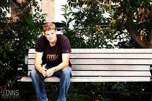
I finally put up a photography portfolio. You can find it at www.enns.net.
In the past I used to use the classic "Contrast" tool, but there are a couple ways which give you much more control, and are less destructive to your photo.
1. Colors > Levels
The histogram you see represents your contrast levels. The black slider on the left represents black, the middle, gray, and the white slider on the right, white.
The general rule of thumb is to slide the black & white sliders to the edge of where the histogram begins to climb on their respective sides. This works best on pictures that include a full range of tones (ie. a photo with some white clouds & dark trees & everything in between).
Photographers, this a tool you should learn how to use. For a great article visit this post. He uses photoshop, but the tool is nearly identical to GIMP's.
2. Colors > Curves
Curves is probably the tool I use the most in GIMP. I make use of it in nearly each photo I retouch. Before making any edits in GIMP, I usually duplicate my background later (Ensure your layers dialogue is showing, right click on the "Background" layer, and select "duplicate".) This allows you to always go back and change something if you don't like it.
The left of the histogram represents your darks/shadows, and the right your lights/highlights. Drag the left end down to increase your shadows, drag the right end up to increase your highlights. Lets say you only want to increase highlights, and want to keep your shadow detail. Select the curve somewhere in the sh adows, and place a point there. Then select the highlights and pull it up. This boost only your highlights and will not mess with the shadows. You can place multiple "lock points" on the curve which gives you good flexibility.
 If you select the Channel drop down menu in the curves dialogue, you can also change the level and contrast of each of your colors (Red, Green, Blue), which allows you to warm & cool your photos or boost certain colors and not others.
For a more advanced look at curves visit Cambridge in Colour.
If you have any other ideas or comments please post! Always love to learn new tricks.
 Technical: F3.2 @ 1/25s, no tripod.
I took this the other day in Union Station in Toronto. I was there with a co-worker and students on the campus I work @ to do some promo video shooting and stills for advertising. The guards made us put away our tripods for security reasons which was a bummer.
A few weeks earlier I had a tripod in there and they didn't catch me. I was able to get a few cool wide-angle shots like the one below. Technical: F2.7 @ 1/6s, no flash, ISO80, tripod
Post-processing: none
This is part one of the "jumping" shots I took for an ad for Word of Life Canada's Snow Camp program.
Technical: F7.1 @ 1/250. Used a polarizer to darken sky and a fisheye lens for the wide-angle. Minor contrast edits in GIMP.
I took this a couple months ago while out with a few friends exploring the woods in the winter. It sat around in a folder for a while until I learned a few new techniques from this post at DIYPhotography. I tried something similar in GIMP. You can also see this photo on my Flickr. 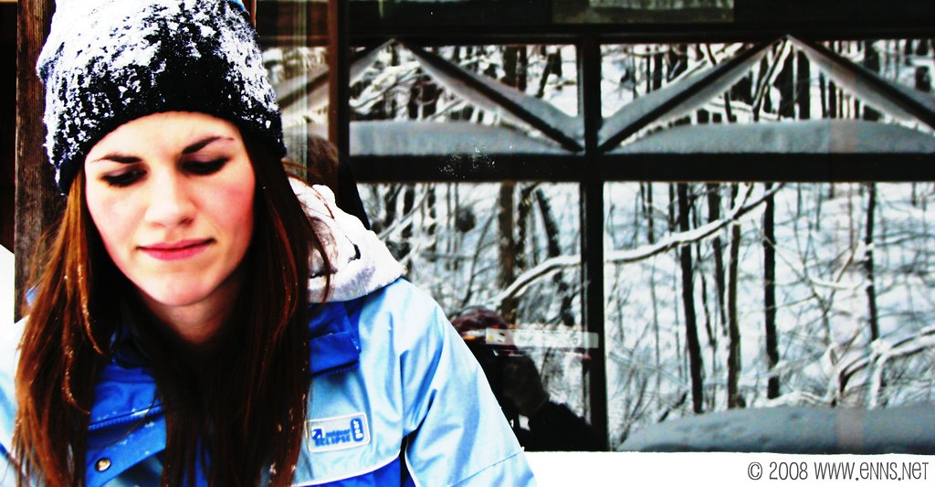
For this photo I used GIMP 2.4 (www.gimp.org).
Basically it is a High Pass Filter in Grain Extract Mode.
To do this:
1. in the Layers Dialogue, duplicate the Background Layer & select the new layer.
2. Select Filters > Gaussian Blur (choose a radius of 15-30 depending on the size of your photo)
3. Select Colors > Invert (Don't Worry It will look normal again!)
4. In your Layers diologue, set the opacity to 50% (The entire photo should be gray with outlines of your subject. This is a High Pass Filter)
5. In the Layers Dialogue change the mode to "Grain Extract".
Play with the opacity of the layer, curves, and if you want merge the two layers and repeat the steps until you get the idea you want...

I was on my way to a spot my friend said was good for photos and was trying to beat the sunset when this view was behind us...We turned the car around and my friend and I got out. I was taking shots when he started running down the road.
View on Flickr